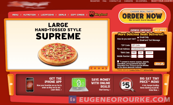
Most landing pages, in efforts to suit the most number of users possible, are crammed full of text, graphics, and special offers. Competing amongst all of these elements (and your copy) is your call to action – most likely leaving visitors confused or indecisive. Below are some suggestions which should (with testing) improve your call to action.
1. Large Call to Action Buttons. Big call to actions work because they stand out more.
- Place your call to action buttons above the fold
- Size does matter. Make sure it’s the biggest, especially if you have multiple buttons on the page
- Start your button’s call to action text with a verb such as Sign Up, Buy, Order, Learn, Donate, Discover
- Use a contrasting color to the rest of your design
2. Support Your Call to Action. Create supporting elements on the landing page, but don’t compete with the main call to action.
- Use graphics that support with your call to action
- Use bullet points to emphasise your offer and its best attributes
- If applicable consider using customer testimonials
- Use plenty of white space in your design
- Avoid placing lengthy paragraphs of text above the fold
- Use a compelling headline
3. Strengthen You Call to Action. This helps to affirm why the user needs to complete the desired action on your landing page.
- Use a brief introduction to describe what makes your offer wonderful
- Tell users why they should choose you over the competition
- Use upbeat positive language
- Address any possible concerns (example: No Contracts or Setup Fees)
4. Reduce Choices. More options are not always better.
- Create unique landing pages for each product
- Simplify your offer and focus on its core benefits
- Aim to have only 1 call to action on a given page
- If more than one offer per page, guide users to make the best decision based on their needs
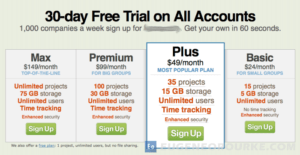
5. Competing Offers. When showing more than one offer on the page, it is important to guide users to selecting the desired call to action.
6. Repeat the Call to Action. It’s ok to repeat your call to action in similar placements on multiple pages (e.g. microsite header).
(via Conversion Room)


